Scatter Diagrams
What is a scatter diagram?
A scatter diagram is a diagram that shows the relationship between two variables. The link between those two variables is called a correlation.
There are three types of correlation in a scatter diagram
~Positive correlation
~Negative correlation
~No correlation
Positive correlation starts from bottom left to top right on a scatter diagram and data on the graph increases as it has two titles.
Negative correlation starts from bottom right to top left on a scatter diagram and information/data decreases on the graph.In a negative correlation the information increases and the other title decreases.
No correlation does not follow a specific pattern and the plots on scatter diagram are not in order
Both positive and negative correlations follow a specific pattern on the graph.
For example if I plotted information on graph about mid- day high temperatures and amounts of ice creams eaten in a town , I would find more people eating ice cream when the temperature is hotter. While colder areas would eat less ice cream due to the weather being colder.Therefore I can find a Positive correlation because the higher the temperature the more ice creams are eaten- the information increases and has two titles.
A negative correlation would occur if I plotted the colder mid day temperatures and ice creams being eaten in a town.I would get a negative correlation because lower the temperature the less amounts of ice cream is being eaten, while a higher temperature will result in more ice creams being eaten-the information increases and also decreases.
How to plot points on Scatter Diagram
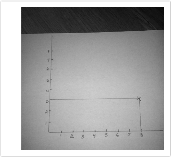
You use the same technique as co-ordernates to plot points on a scatter diagram-'Along the corridor up the stairs'
For example if I wanted to plot (8,3) on a scatter diagram, I count 8 points along the x axis, the horizontal line. Then 3 up the y axis, the vertical line.The two numbers should then meet and that's were you plot your point on the scatter diagram. (please view the picture at the bottom)